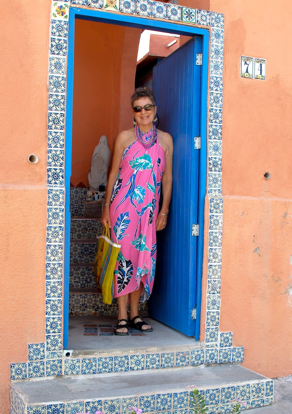

My friend Liz has the best color eye, so I turned to her about the shades for the ugly grey wall across the street. She gave me sage advice and sent along some photos she had taken when she was in Marrakesh, Morocco. This one grabbed me immediately!

To my eye the door color is not quite turquoise, not quite teal but somewhere in between. I had decided to paint the bottom 3/4 a green shade, the top what here would be called Corona blue (for the beer company's ubiquitous advertising colors). But what shade of green? Too dark and the leaves of the plants would not show up. Too lime-y and it would look like a giant margarita mix. But this door color would be perfect.
So off we went to the paint store yesterday. I fanned through two of their color wheels, hemming and hawing, picking and rejecting. (I should note that my color vision is not what it used to be, especially in the blue/green shades; too much laser surgery.) But I finally hit upon these two colors, had a liter of each mixed and hoped I was somewhere in the ball park.

Once I got a look at the allegedly "green" I had chosen I realized it was much too turquoise. I put up a sample on the wall to see it in situ.

To my eye the turquoise shade is nowhere close to what I'm after. I've looked around the house for something I have that is the shade I want. I've come up with a pillow case that's closer, in the green family. So it's back to the Prisa store toting my pillow case for another try.

I also looked at the paint job with the lighter color on top, the rich blue on the bottom but it's too dark. Besides, it would look like a giant Corona ad; all it would need are a few bottles painted on it. I wanted the green to be sort of jungle-y with the blue of the sea on top.
You know, this just might be a fool's errand!
No comments:
Post a Comment